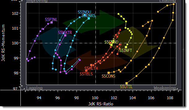
This looks like Bloomberg's Relative Rotation Graph.
x axis = relative strength of selected sectors versus the benchmark
y axis = rate of change of that relative strength
The 'walk' of the lines show how the sector relative strength and rate of change thereof has changed over your lookback period. The box is where the sector is presently.