Page 1 of 1
Questions about Sector rotation chart?
Posted: Mon Jul 15, 2013 5:42 am
by oem7110
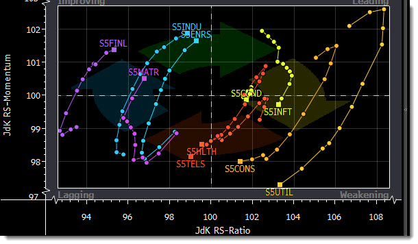
Does anyone know what kind of moment (y-axis) and ratio (x-axis) are talking about referring on following image?
Does anyone have any suggestions?
Thanks in advance for any suggestions
Posted: Tue Aug 27, 2013 5:55 am
by supercrunchr
This looks like Bloomberg's Relative Rotation Graph.
x axis = relative strength of selected sectors versus the benchmark
y axis = rate of change of that relative strength
The 'walk' of the lines show how the sector relative strength and rate of change thereof has changed over your lookback period. The box is where the sector is presently.
Hope this helps.
Posted: Sat Nov 09, 2013 10:31 pm
by oem7110
Do you have any suggestions on how to select the top3 sectors based on the best combination between relative strength and rate of change ?
Thank you very much for any suggestions :>