Monte Carlo Simulations

Contents
A Monte Carlo simulation is one way of determining the robustness of a system, and in answering the question:
"What if the past had been just slightly different"?
Trading Blox 's Monte Carlo feature simulates new equity curves that are similar to the actual test equity curve, but different in certain random ways. A typical Monte Carlo simulation might generate hundreds or thousands of new equity curves. How many it will generate is adjustable changing the value in the Preference's Monte Carlo Parameters.
Trading Blox supports two different randomization algorithms for the simulation of the Monte Carlo equity curves:
Reordering and Sampling with Replacement.
In each case, the new equity curves are generated by taking portions of the actual test equity curve and changing the order in how they happened.
In real trading, bad days occur together with a frequency that is much higher than one might attribute to purely random chance. This is because at the end of large trends, many markets seem to get carried along and then reverse at the same time. The period of a system's maximum draw-down is usually a statistically improbable series of down periods.
Trading Blox allows you to specify the number of days which make up each portion using the preference "Sample Grouping Days". This Monte Carlo feature allows you to generate equity curves which maintain some of the auto-correlation found in actual the equity curves. Without this feature, Monte Carlo simulations tend to underestimate the potential for large or lengthy draw-downs because the randomization process will result in equity curves that don't often show the lengthy periods of negative returns since they are statistically unlikely.
Reordering
The equity curve is randomly rearranged so that each portion appears in a different order:
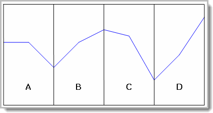
Consider an equity curve like the above divided into four sections. If you simply reorder then you could have orders:
ABDC
ABCD
ACBD
ACBC
BCDA
BDCA
DCAB
DCBA
CDBA
etc.
Notice how an equity curve that contains AC adjacent to each other, i.e. ACDB, BACD, etc.. This placement will have a larger draw-down than the original equity curve because the reordered curve combines two down periods which were not adjacent in the original equity curve.
However since each of the individual sections of the equity curve represents a net percentage change in equity, any reordering of the equity curves will result in exactly the same endpoint and therefore will result in the same CAGR%.
The following shows the results of plotting the reordered equity curves (in gray) against the actual simulated equity curve (in blue):

Monte Carlos Equity Curve - Re-Ordering
Notice how all the curves each end at the same point when Re-Ordering is the sampling process.
This graph shows the Monte Carlo - Re-Ordering CAGR% graph:
Monte Carlos Equity Curve - Re-Ordering - CAGR%
Sampling with Replacement
The other method of simulating a new equity curve is called "Sampling with Replacement". This method generates a new equity curve by randomly selecting from the actual test equity curve with the additional provision that portions of the original equity curve can be used move than once.
Thus you could have excellent curves like:
BDBD
BDDB
BBBB
or even:
DDDD
The following shows the results of plotting the equity curves from Sampling with Replacement (in gray) against the actual simulated equity curve (in blue):

Monte Carlos Equity Curve - Sample & Replace
Notice how each of the curves has a different endpoint representing a different CAGR%.
This graph shows the Monte Carlo - Sample & Replace CAGR% graph:

Monte Carlos Equity Curve - Sample & Replace - CAGR%
Many of the Monte Carlo graphs plot the distribution and cumulative distribution figures for various test measures, CAGR%, MAR Ratio, Maximum Draw-down etc.
Note the red line in each of the CAGR% graphs. The red line labeled 90% confidence is where the red line intersects with the cumulative equity curve on the graph. This means that 90% of the simulation's tests showed an equity curve with a CAGR% greater than percentage value shown by the vertical green line.
Some Cautions
Beginning traders and system testers often look at particular test results and think that they mean more than they actually represent. The future will not look like the past but will probably look something like the past. A simulation graph like the above helps one think in terms of the reality that the future will be one of many different possibilities, some better than the test results some worse than the test results.
The confidence levels used by Trading Blox indicate only that a certain percentage of the results of the simulation are better for the given measure. The use of the term Confidence Level is common in the industry for this purpose. The use of the term does not imply that the test indicates that the future will result in a certain probability of a particular outcome. In other words, just because a test shows a 95% confidence level of a certain return or other measure does not mean that Trading Blox is predicting that there is a 95% chance of exceeding that measure in actual trading.
The confidence level can be set by the Monte Carlo preference settings. Some traders prefer to use 90% or 95% confidence levels.
Edit Time: 9/12/2020 9:50:00 AM |
Topic ID#: 175 |